
Result: The client was happy with our proposed redesign and booking flow and the proposal was implemented by the development team post-internship.
Understanding the user and her vacation planning journey
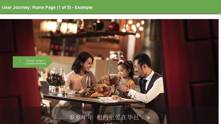
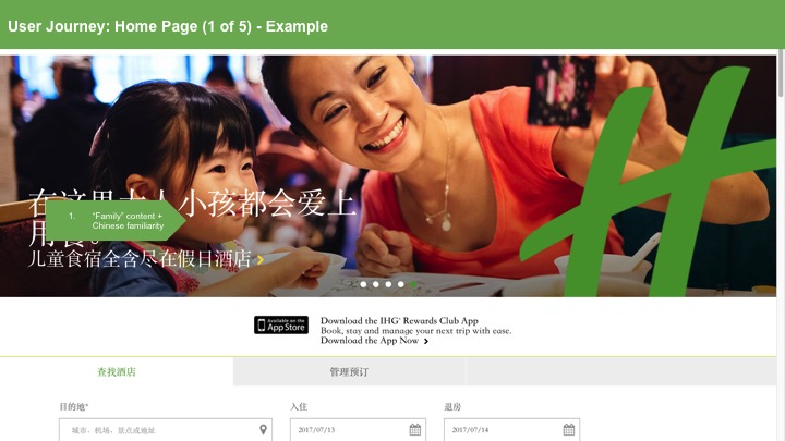
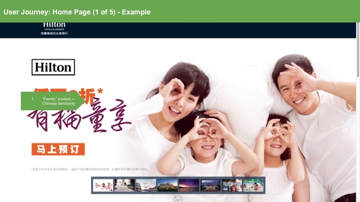
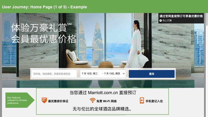
I first began the redesign process by conducting primary and secondary research into the Chinese market. Based on Chinese travel trends and statistics from sources such as Google Travel Trends 2016 and Marriot's Hurun Report 2016 and on interviews with Chinese tourists and office staff I ambushed (or rather kindly approached) on the street, I narrowed down the Chinese travel consumer market specifically to young professional couples travelling with their families for leisure and mapped out their user journey (statistics are found below the user journey map):

Conducting UX audit of the existing site
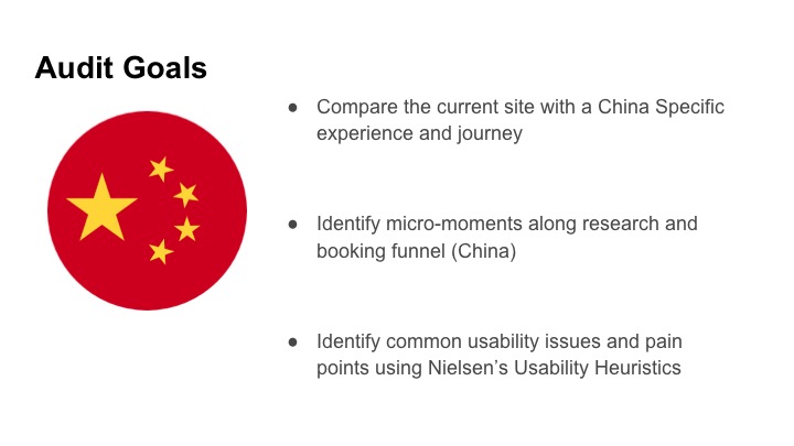
I then did a UX audit of the existing site through a heuristic evaluation of the site based on this user research, hotel industry web standards and Nielsen's 10 Usability Heuristics for User Interface Design and through providing recommendations of specific ways the site could be improved.
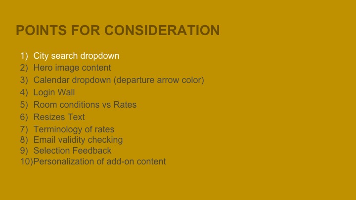
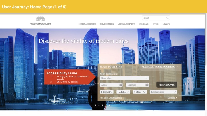
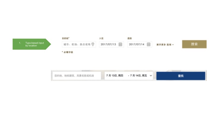
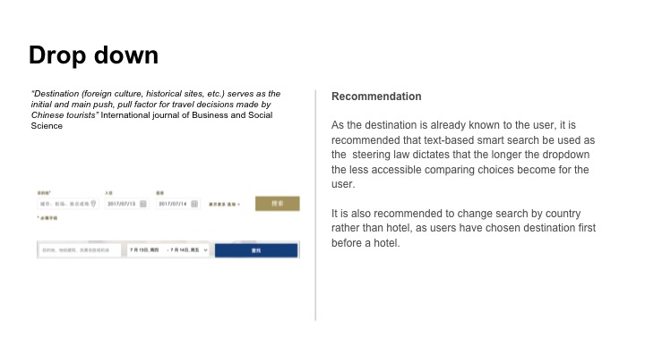
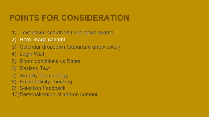
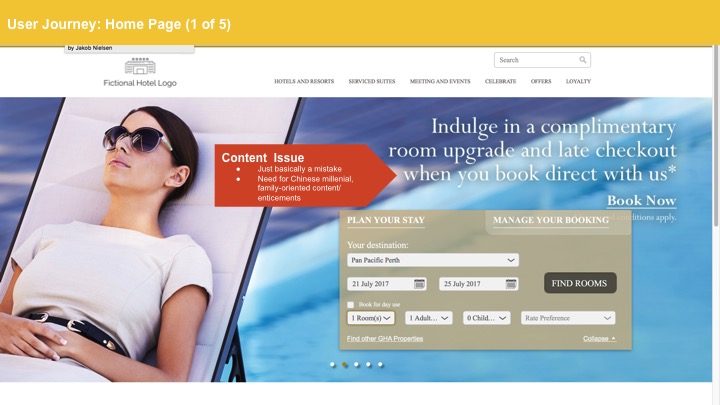
Below are some of the slides I used to document my audit (please click the slide below to see the next):
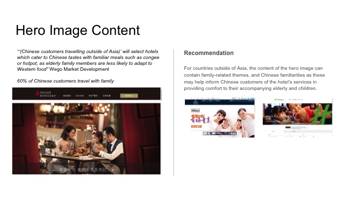
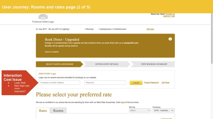
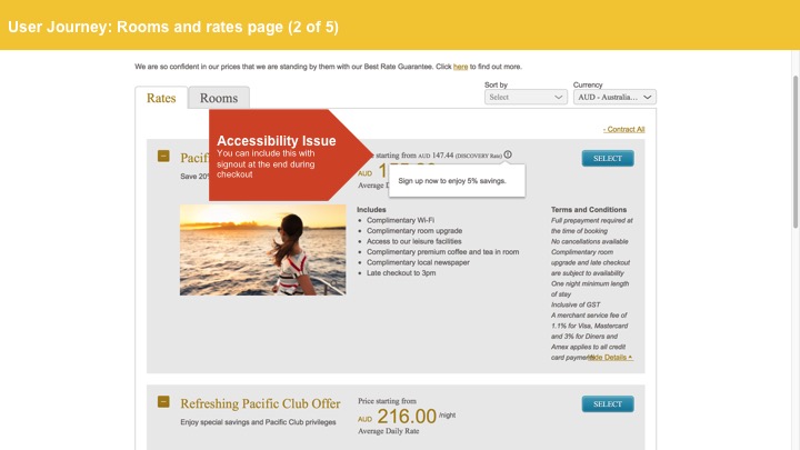
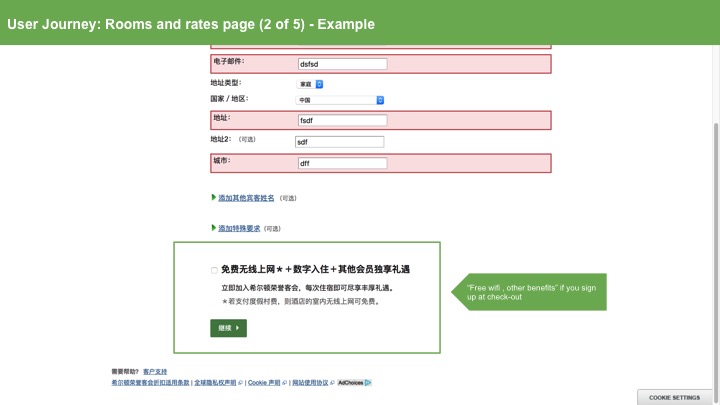
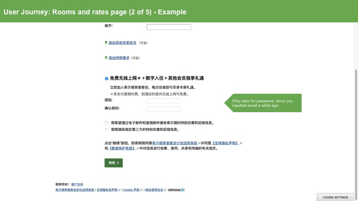
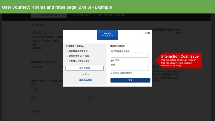
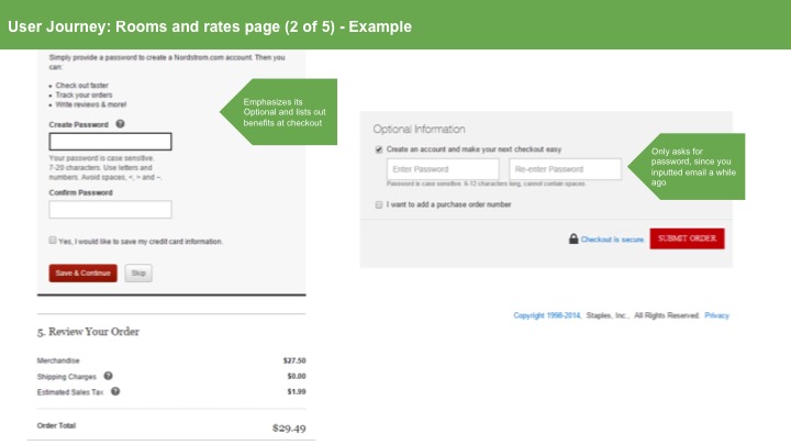
To see the full deck, please visit this link.
Combining recommendations and prototyping
Using the recommendations from the audit, I then began combining these recommendations together to create a user task flow and prototype for user testing later on. With input from Richard:
Developed a China-specific customer journey taking into consideration the persona's existing habits and behaviours.
Brainstormed some ideas of how to combine these recommendations through wireframe sketches, while considering the sequential information architecture of the site, and developed a prototype for user testing:
See the developed journey in spreadsheet format here.

Deciding and prioritising what content was most relevant to the persona was most challenging due to the limited space available in the card components of various pages. Readability and the usefulness of information to the persona were important points I considered when coming up with ideas (for example the hotel selection card component below):

I used a medium-fidelity mock-up for user testing to get a balance between a real look-alike of the website and the need to test designs faster to discover issues.
Qualitative user testing to identify usability issues with the design
(My full user testing process can be found in this online document.)
I tested with 5 users who were composed of my colleagues from the mainland. As not everyone fit the profile of the persona, I asked the testee to assume the position of the persona by presenting them with a task and with pictures of the persona:

Before the test, I asked permission if I could record the user's audio and screen actions in order for me to study later on and for me to show as portfolio work. Here is one of the videos of the user test I conducted:
User Testing Recording Sample
Prioritising Usability Issues
I then did some affinity mapping to categorize painpoints according to user action and to page elements and prioritized these painpoints based on the goals of the business and the goals of the user according to research and interviews:


Iterating and Back to User Testing
I then decided to iterate based on the pain points which were most important to both the user and the business. Here are iterations I made to solve some of the pain-points I discovered:
Pain-point 1: Difficulty finding the add another room button and redundancy of booking rooms according to occupants
Pain-point 2: Confusion over one's current stage in the booking Flow
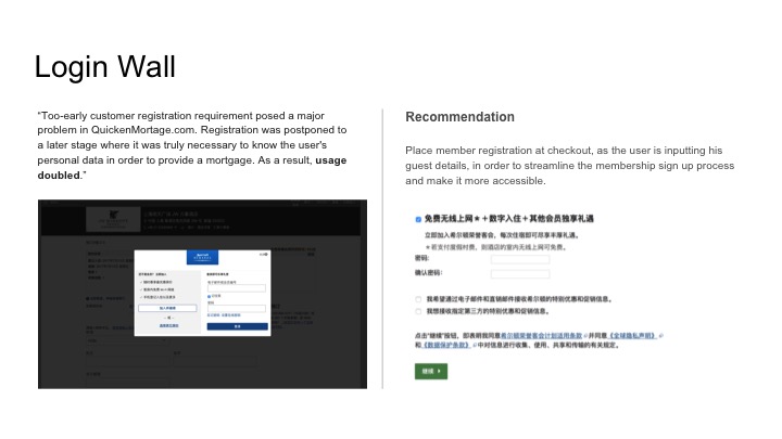
Pain-point 3 and 4: Inconvenience of selecting the same room type twice + missing the discount offer upon signing-up or logging-in ad
Pain-point 5: Confusion over payment method selection
User Testing the iterations and Results
I tested these iterations again with another 5 different users (mostly Mainland Chinese colleagues in my dorm) to validate these changes. These are the results:

Visual design and Conclusion
After validating the iteration, I then proceeded to design the UI according the Pan Pacific's brand guidelines. Overall, I learned a lot about the UX process being done in the digital agency world. There are a lot of trade-offs between time and resources and being able to fully develop all aspects of the website. While the proposal was not picked by the hotel at the end, the research and persona we developed went into the another project pitch in Beijing!
