

Download the app here: Github link
The gist:
1. Problem
Cognitive behavior therapy through guided journaling has been shown to have stress-reducing, goal-orienting and psychologically healing benefits, but for many youth, beginning this therapy is difficult because of the chore of writing and because of the stigma associated with needing mental health treatment. This barrier to entry was what we wanted to solve.
2. Solution
Granny is a mobile audio-journaling app which makes it easier for youth to understand, record and monitor their emotions over time through AI-powered natural conversation.
3. Product goals
In terms of the UX, the goal was to make it simple and intuitive. Youth should be able to easily see and extract useful information from their experiences and emotions through the data visualizations provided. They should also be able to converse with the Granny avatar as natural as possible in a way that seems like you’re talking with a friend (or your grandma if she’s your friend).
The app’s success would be measured by conducting a pre-use and post-use quantitative and qualitative surveys analyzing the effects of the app on youth with similar mental states and backgrounds, over a set period of time (usually a month based on previous case studies online of similar apps).
However, as this project was created for the twenty-four hour hackathon, we were not able to do so, but we do intend to do it for future development.
Developing the Persona
In order to understand the habits and behaviors of students when feeling depressed and their attitudes towards mental health, we came up with a short ten-question survey based on depression and mental health research in Hong Kong and some background questions (the google form of which can be found here).
Based on the twelve fellow Hong Kong local hackers we interviewed, the biggest takeaways we took from our research are:
Most students confide to family or a close friend when depressed.80% of candidates wrote that they reach out to a friend or family member for consolation
There is a stigma associated with needing mental health. Students have mentioned that in Hong Kong, people in need of mental health are looked down upon.
Nobody keeps a journal or diary of some sort to write experiences down. 0% of students have a diary
Students take many short breaks in a day. 80% of students say they take more than 3 breaks a day due to mental stress
50% of users have at least one health-related app. 3 of which have mental health apps.
From these survey results, we developed a persona that served as the backbone of our design decisions throughout the project:

Competitor Analysis
We also conducted an informal competitor analysis to understand what the strengths and weaknesses (user pain points) of other depression apps that existed out there. Based on this, we found four mobile apps which we based the features and user experience of our app from:

Brainstorming and Exploring
After analyzing our research, we started to brainstorm some use cases and ideas we had to separate us and to work on top of competitors have done and to suit the motivations, needs and goals of our persona.
Primary use cases (Product Goals):
To gain mental support and relief throughout the day
To improve from negative habits and thoughts
To record their experiences overtime easily
To track and gain useful insight to their emotions overtime
Then, we brainstormed some features which would help users achieve these use cases/goals:
To record their experiences overtime easily
Audio-journaling through natural conversation (like a chatbot) using LUIS and various API (IBM Watson Tone Analyzer API and Silence Recognition API, Speech-to-text API, Text-to-Speech API, etc. API)
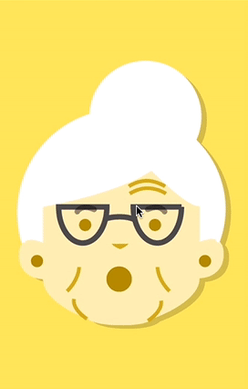
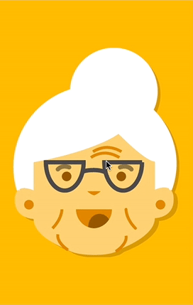
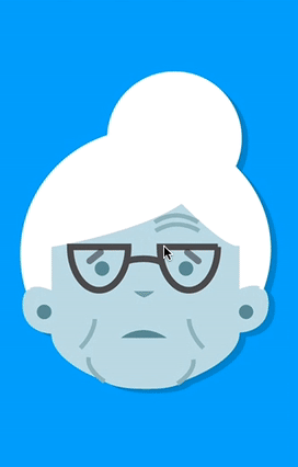
A youth-friendly avatar which mimics the facial emotion of the user through Microsoft’s Facial Emotion API to provide a sense of empathy to aid the natural conversation feature (and based on user surveys, we chose a family member to be the avatar: a Grandma)
To gain mental support and relief throughout the day
The natural conversation feature is framed around the CBT method. CBT as a method to reduce stress
To improve from negative habits and thoughts
Emotion pattern recognition to give suggestions of further action to the user. by incorporating some machine learning methods to recognize patterns of emotional data
To track and gain useful insight from their emotions overtime easily
Dashboard with data visualizations of emotional data using Chart.js
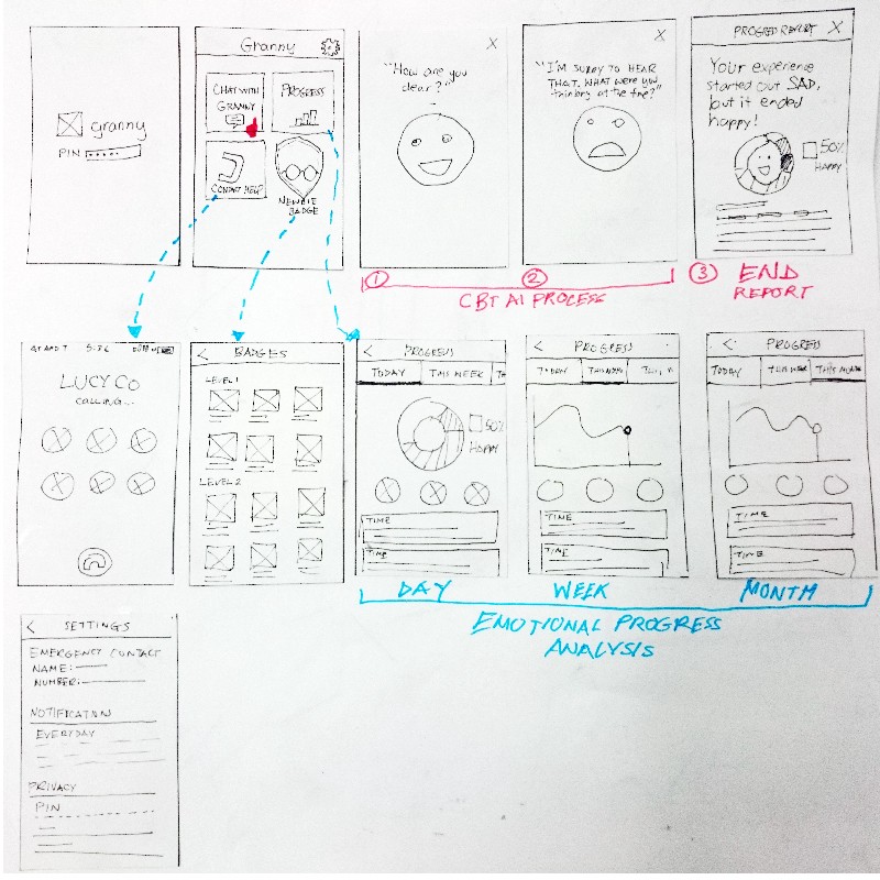
Brainstorming the app and the user flow
With these features in mind, we needed to figure out 1) how exactly a user would use this product, 2) what was important to the user in each step and 3) what screens we needed to include. This helped us understand where problems could be and how we could solve it. So I sketched out some initial ideas I had with the direction we had in mind:
To structure this flow after our persona’s behavior, we placed our persona Jerry in a case where he just had received an internship rejection and imagined ourselves in his shoes using the app:

From this flow, we then revised our initial ideas and developed a working prototype to test it out on real users later on.
Usability testing
To test its usability, we first oriented the user of what the app does, and then based on our product goals to make the app easy for the user 1) to record their experience and 2) track their emotions, we came up with three scenarios with a series of series tasks for the user to accomplish.
You just had a negative experience that made you feel sad and you want to talk with Granny about it. How would you begin a conversation with Granny?
After this conversation, you want to see your journal entry again. How would you do it?
You want to see search for a journal entry with the phrase “dog”. How would you do it?
You want to track how your emotions change overtime in the app. How would would you do it? (Note: we preloaded some entries before this)
After this testing, we also asked what the participants how they felt about the interaction with Granny.
In the end, we tested this out with four fellow hackers, and reviewed our notes. From our usability study, we discovered the following pain points:
Pain Point 1: Users had difficulty associating the plus button to talking with Granny

Half of users hesitated before clicking the plus button and asked whether this button associated with starting a conversation with Granny.
Pain Point 2: The emotions of Granny were not that evident
When asked if talking to granny seemed natural, all four users felt that talking to Granny was like talking to a robot, because of the way she sounded and the fact that her face was not very emotive.
Pain Point 3: Users did not know when to respond to Granny
While we used the silence detection API to detect when the user wasn’t speaking, it was extremely slow and it took quite a while before Granny gave a response to the all the user’s answers. Because of this, from our observation, the users were confused at times and hesitated to respond or not during these moments of silence as we realized there was no instant feedback mechanism.
Iteration
We went back to the drawing board and sketch some potential solutions. After which, I tested the low-fidelity sketches with my group mates to receive feedback.
Prototyping and Validation
We then jumped back to prototyping, and tested the app with four more individuals due to time constraints. Besides the solutions we came up with for pain points 1–2, only the solution for the feedback mechanism has to be reiterated as the play icon we used to signal to the user that he can begin speaking was ambiguous and had another symbolic meaning to the two users. Below are the high-fidelity screens of our final solutions:
Pain Point 1: Users had difficulty associating the plus button to talking with Granny
Solution: Change the + in the Floating action button to a chat symbol to make it evident that its used for chatting with Granny.

Pain Point 2: The emotions of Granny were not that evident
Solution: Use colors to reflect the emotions of Granny as a way of creating a sense of empathy/feedback, so I designed and organized the expressions and colors of granny according to the 7 emotions that Microsoft’s facial emotion API provides. All users were amused!

Pain Point 3: Users did not know when to respond to Granny
Solution: I modeled this function off the way Apple’s Siri works - containing a microphone which signals to the user that he can speak, a waveform which mimics the user’s voice pitch to allow the user to know he is being recorded/listened to and a beginning and ending audio sound which tells the user that his answer was received. 100% of users were not confused to respond.

Also, one of the features I’d like to note is the suicide risk feature which uses machine learning (regression) to predict highly depressed patients in the backend (based off some demo dummy data we provided) and which suggests users to call a relative or a connected mental health practioner. In future developments, we hope to use real data to support this eventually and below is the screen of the situation when the app detects a possible severe case of depression:

What I learned and how I would improve the app
Moving forward, this will be a really cool project to work on. Because of time constraints, we weren’t able to really test the effectiveness of our app helping youth distress by actually conducting pre- and post- survey experiments of the app on students for a set amount time. Also, we would also like to know whether we can actually get youth to be interested in understanding their emotions in the first place?
We also discovered some issues with some of the functions and technologies we utilized:
Problem 1: One of the judges commented that it was a waste to not utilize the emotion data gathered for more useful benefits for the end user, besides an analysis of his emotions over time
Potential Improvement: We are planning to further expand the function of the app to making it a monitoring tool for health practitioners allowing them to monitor their patient’s emotions and experiences through a web platform.
Problem 2: Limited variation in responses by Granny
Potential Improvement: now that we have time after the hackathon, with further iterations and improvements in the AI, we hope to make the conversation more natural and responsive to user’s inputs.
