

My Design Process
My design process generally consisted of a combination of Nielsen Norman’s Design Thinking 101 article and Stacey Wang’s recent Fitbit: A UX Case study process article as their design processes helped ensure that the decisions I made were always based off user research:

Identifying the Persona
In order to identify and understand who the primary users of Cathay’s app are, I did some preliminary online research. Based on a Linkedin’s Cathay Pacific Case study, Google’s 2014 traveler research studies and GBTA 2015 studies, I learned that:
- Cathay’s primary target market are Business travelers from large corporations, followed by business travelers from small-to-medium sized corporations who are the business’s secondary market.
- 78% of business travelers used their mobile app for most phases of the travel process.
- 63% of these travelers are users or have used airline mobile apps for managing their total travel process.
From these papers, I also discovered plenty of studies behind this market’s needs, behaviors and goals. In addition, the characteristics of both the primary and secondary business traveler markets were very similar, with the exception that the latter was more price-sensitive. Because of this similarity, I created a provisional persona named Jerry Wilson that served both of them, which helped me rationalize my design decisions throughout this project from this persona’s needs, behaviors and motivations:

Job Stories
Using the Jobs To be Done Framework, I came up with three contexts by which the persona would use the two features mentioned in the Cathay Pacific app in order to understand their motivations from interviews I conducted.
The interviewees were Hong Kong friends from my social networks who worked for multinational companies and often traveled using Cathay. Although only three of them had used the Cathay Pacific app before, all of them have used the company’s website to check flight statuses.
In any case, these interviews helped shape the job stories of users who would use the app’s these features:

Guerrilla Usability Testing
From these stories and my understanding of the core use of the feature, I developed three scenarios with a series of tasks in order to test these feature’s usability. For all three scenarios, I used the context of them not being signed in to make the scenarios as real as possible as in reality, the app signs you off almost immediately after you spend some time not using it:
Scenario 1: You’re planning a business trip from Hong Kong to Singapore sometime within the next three days and you want to check available flight times during these days so you can adjust your schedule. How would you do it?
Scenario 2: You’re working on your laptop in the Hong Kong airport’s Starbucks, and your flight’s boarding call going to Singapore hasn’t been announced. You want to check its current status to find out whats up. What would you do?*
Scenario 3: Your waiting for your client flying into Hong Kong from Amsterdam in the airport coffee shop,and you want to check what time his flight lands. How would you check his flight status?*
Notes:
- As scenario 2 and 3, I pre-checked flights and gave a specific flight number for users to use.
To put these scenarios to the test, I went to the Starbucks along Duddell street in Hong Kong’s Central business district, and pounced on lone people with the following strategy:
- With my friend(it always help to bring someone for leverage), I approached people who look like their not too busy.
- Verify if they are a frequent travelers and have used the Cathay pacific app before or any other travelling companion app or airline website.
- I then explained to them the purpose of my experiment, and that it would only take a minute. (although tbh it took at most 5 minutes)
- If they have downloaded/used the Cathay app before, I asked them “what they used the app before for?” open-endedly
- I gave them the scenario and encouraged them to think aloud as they went through the application,
- Observed and took notes down.
- Thank them for their time.
Overall, I interviewed seven(7) people from 12 pm to 2 pm. This was certainly a very daunting process as I had never done this before, but I’m glad I did as this helped me discover some user pain points in the app’s flight status feature. All of them were frequent travelers who have used Cathay’s website for various travel services, and three had used the Cathay Pacific app before as a part of their travel process:

Categorizing and Identifying Pain Points
After the test, I reviewed the notes from my observations, and I discovered the following pain points categorized according to function:
Planning a trip
Pain point 1: Users could not check flight times on days after inputted preferred date on the results page

100% of users used the “Book your next trip” card on the homepage to look for flight times for the next three days when planning a trip. However, once users inputted their flight search details, users had to keep going back to this search page in order to check for flight times other than those existing for the date inputted by the user, doing this only after looking for an option to see flights on other days in the same results page:
Checking flight statuses
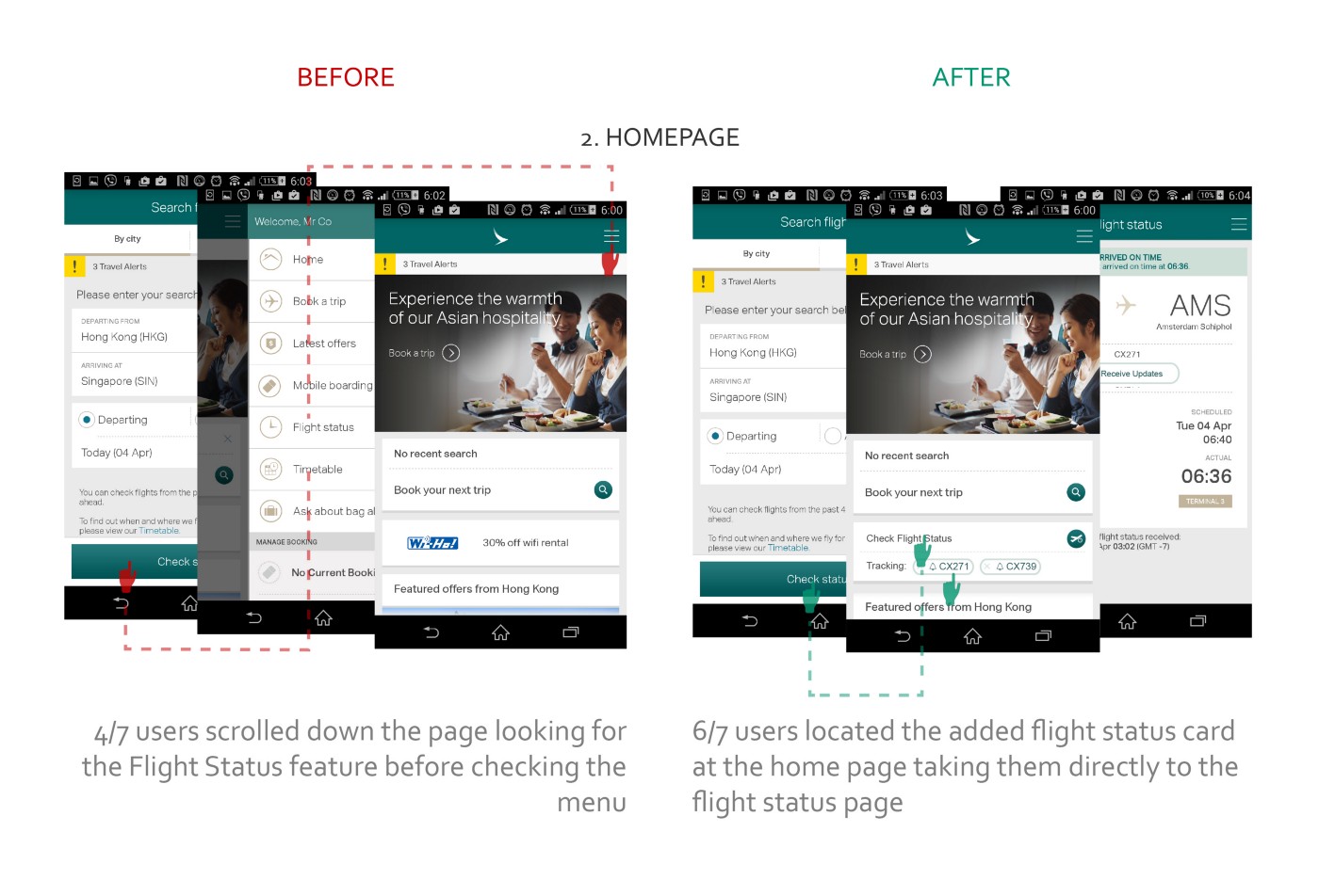
Pain point 2: Difficulty finding the flight status feature

To check for flight statuses (for example when waiting on a colleague's incoming flight in scenario 3), there is only one point of entry to get to this flight status feature and that is through the hamburger menu on navigation bar. However, 57% (four out of seven) users scrolled down the home page looking for the flight status feature before checking the hamburger menu, implying a discoverability issue.
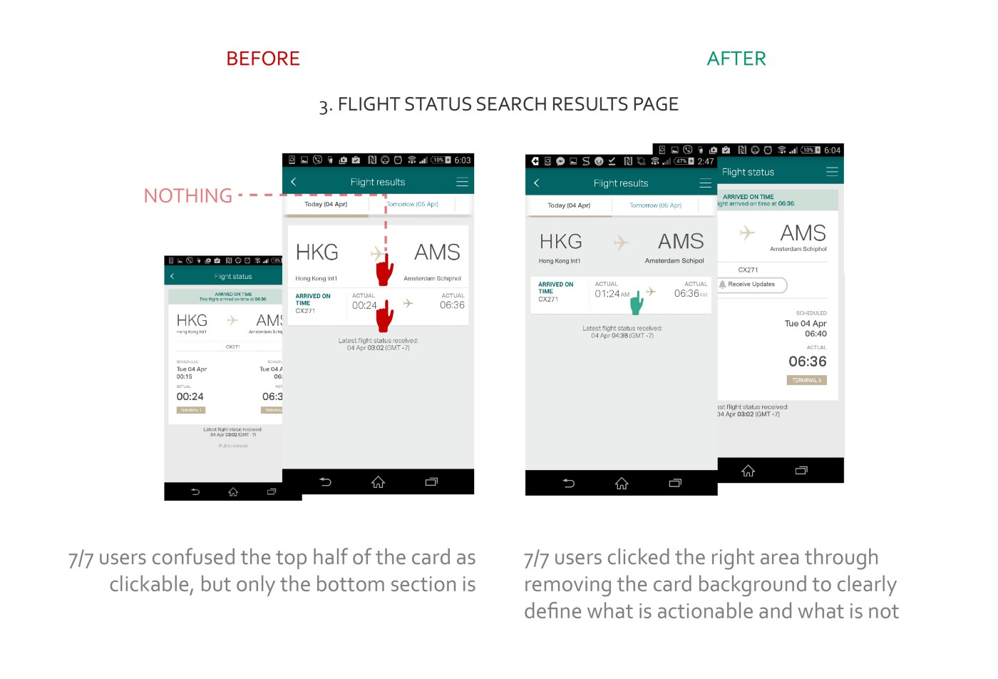
Pain point 3: The card component implies it is clickable, but it isn’t clickable.
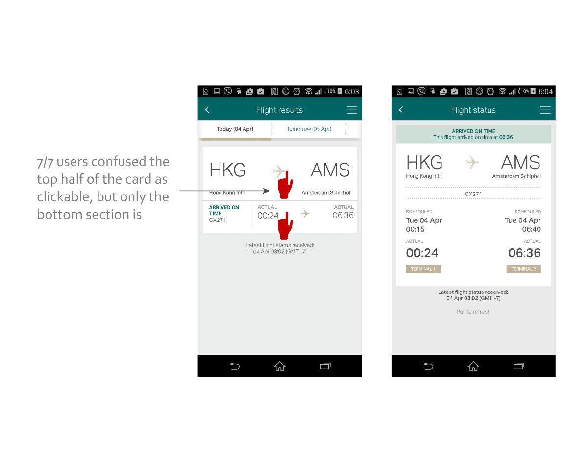
When checking for flights to Amsterdam (for example) as in scenario 3 where CX only has one flight per day, the user’s does not know that only the bottom half of the card is clickable, as the bottom-half looks like it is part of the overall larger card. This was a pain point surprisingly experienced by all users.
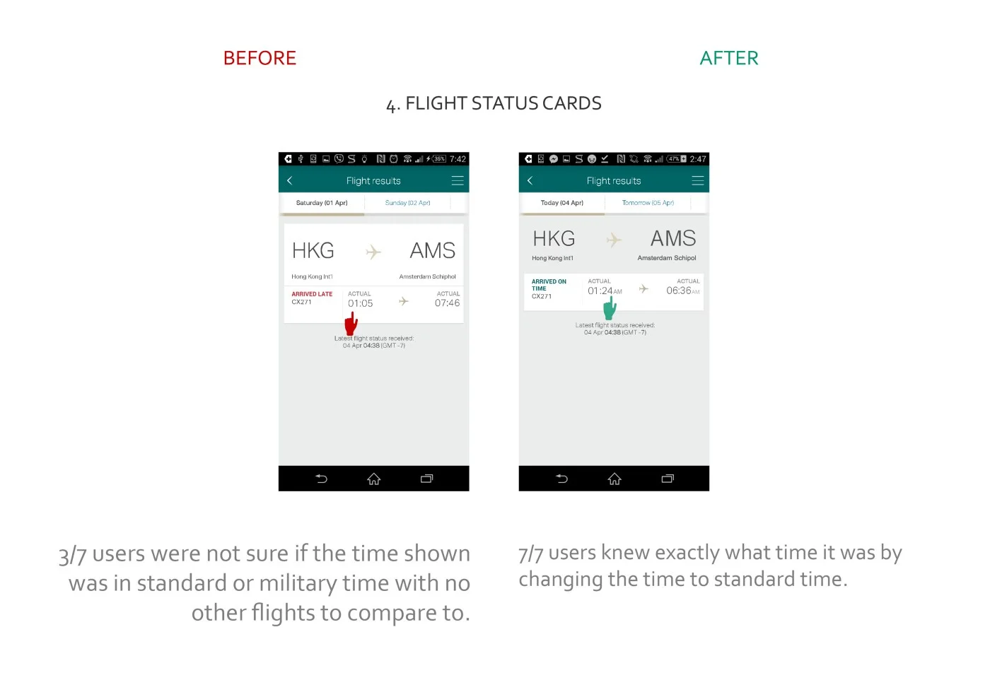
Pain point 4: Users had a hard time understanding the terminology used for times

Around 42% of users weren’t sure of whether the time displayed was in Standard Time or Military time in scenario 3. This perhaps would not be an issue if there were other flights going to/from the same destination in the day to compare times to as in Scenario 1 and 2, but still, this showed that there is a need to clarify terms.
Mapping task flow with Pain Points
I mapped out the task flow of a user in two situations that were determined by whether the user was checking on their own flight, or someone else’s based on the job cases and highlighted areas where pain points existed:

This task flow also helped me to identify one more potential pain point for the user as indicated by the bracketed steps in flight status checking process. These series of steps highlight an issue for scenario 3 where if the user is waiting for his client’s incoming flight, what happens when his client’s flight’s estimated time of arrival gets delayed by an hour for example? Does the user have to keep checking the flight status every so often? This seems to be provide an inefficiency for the user.
(Possible) Pain point 5: User has no way to keep track of changes in flight status in a conveniently
There just isn’t an option to allow the user to be notified of changes in flight status, which poses a hassle for users in scenario 3.
Brainstorming Solutions
After understanding the task flows and pain points of users, I then sketched out some possible solutions to each pain point:

I did some informal usability testing of these low-fidelity sketches with a few interviewees and then narrowed down the possible solutions to make into high-fidelity mockups.
Prototyping and Testing
After narrowing down possible solutions, I used Illustrator to create some Hi-Fidelity mock ups to test out my prototype. From testing this prototype with seven new HassPossparticipants, the results of the redesign turned out to be more successful in solving the previously mentioned pain points:
Pain point 1: Users could not check flight times on days after inputted preferred date on the results page
Design solution: Add a method by which users can quickly browse through different days on the “book a trip” results page.

Pain point 2: Difficulty finding the flight status feature
Design solution: Place a “Check flight status” feature on the home page below the Book a trip feature (as booking a trip is more integral to the Cathay App’s main use case based on online research than allowing the user to check flight status)
Pain point 3: The card component implies it is clickable, but it isn’t clickable.
Design solution: Remove the card background of the head titles to imply that it is not clickable, and that the cards below are clickable.
Pain point 4: Users had a hard time understanding the terminology used for times
Design solution: Changing the times to standard time to make times of flights with only one flight per day more clear to users.
(Possible) Pain point 5: User has no way to keep track of changes in flight status in a conveniently
Design solution: Add a tracking option which notifies user through email, text or push notification based on what the user prefers.

Here are the statistics of my redesign that I got from testing with another set of 7 users:

What I learned
I learned that even the smallest of changes like removing a background card component can make the user experience of an app more convenient and more accessible to users. And overall, I really enjoyed the experience and I’m planning to do this sort of exercise again sometime in the near future.